
This section explains the app’s display and control elements as well as the integrated help options.
The app provides a powerful and easily accessible interface with a user-centred design for smartphones and desktop devices (or equivalent).
The app should be available everywhere with the same range of functions as far as possible. So also on smartphones. Functionally, the app does not aim to favor any one type of device or place of work.
Surface elements
The following segments explain the structure of the app based on the markings in this graphic:
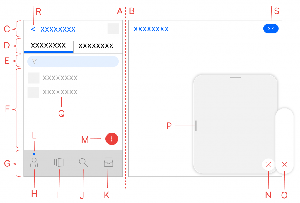
Brief overview
- a) Smartphone design
- b) Desktop Design
- c) Title bar
- d) Tabs
- e) List filter and list refresh
- f) Content area or listings
- g) Topic bar
- h) “Me” – Personal global overview
- i) “Vault” – menu of the current vault
- j) Local or global search
- k) Local or global tasks
- l) Indicator for global or local
- m) Action button
- n) Menu / dialog
- o) Quick actions
- p) Resizing dialog / menu
- q) List entries
- r) Back / History
- s) Status information on the content
Smartphone and desktop display (single/two-column) (A)(B)
The app automatically recognizes the shape of the device. If it is a smartphone, a single-column display (A) is used. This is known as a smartphone .
If the resolution is higher, the interface switches to a two-column design (A) plus (B). This is referred to as a desktop , but can also range from a foldable device to a tablet to a regular desktop device. If the desktop view is active, the right-hand tab is often hidden from the selection of tabs (D) and transferred to the right-hand dialog page.
Title bar (C)
The name of the current content is displayed in the title bar . To the right is a matching symbol image. The title may vary depending on the smartphone or desktop display. Accordingly, actions, e.g. via the action button (M), have different effects.
Status information (S)
Depending on the content type, additional information, e.g. processing status information, is displayed in the title bar (S), but also in lists (Q):
| Icon | Meaning |
|---|---|
 | This content is being edited by another user. Move your mouse pointer over the symbol and get information about this editor |
 | This content is under construction. The current processing status can be found on the desk of the relevant shelf. |
 | This content is linked to other content. Select this icon to see all linked content in the See also dialog and to switch to this content |
 | This content is permanently linked to the currently selected folder, i.e. it is anchored |
 | This content is currently in version X.X and is not versioned, i.e. can be deleted |
 | This content is currently in version X.X and is versioned, so can only be deleted after the end of the retention period |
Back / History (R)
When navigating through content, the app remembers most of the content as a history, which is made visible by a blue arrow in front of the title display. There are two ways to operate them:
- A simple selection (click or touch) of the blue arrow takes you back to the last content you visited
- A longer selection (click/touch briefly) displays the history with a list of content
Use history
If the history has been selected, a list of recently visited content appears (not all content is suitable for this). The simple selection of a content changes there.
You can close the history by selecting the X at the bottom. The history is automatically deleted when you exit the app/log out.
Tabs (C)
The tabs further divide the current content into different topics and should therefore enable an even more effective selection.
A typical example is a folder/magnet. There, the display is divided into the Folders and Documents tabs. This ensures quick access to subfolders, but also a clear list of documents without mixing them with folders.
The tabs are partly dependent on the authorizations of the logged-in user.
Action button (M)
The red action button is a central element of the app in terms of functionality and is therefore visually highlighted. The functions are based on the current content, user rights and the status of a piece of content.
The action button has two operating options:
A quick selection of the action button almost always reveals the quick actions. This is a list of symbol images for the most relevant actions.
By selecting the action button for a longer period of time (press and hold the mouse pointer or hold your finger for a longer period of time), all actions and possible dialogs for the current content are displayed in a menu.
After selecting the action button, it offers a red X. Selecting the X cancels the menus.
Change sizes of dialogs and menus (P)
The app makes it possible to change the display area of the dialogs and menus in order to make the best possible use of the available screen space.
To change the sizes, hold down the mouse pointer or drag the highlighted bars to the left or top of the dialog / menu. The app remembers these settings for the device and for each dialog/menu.
Topic bar (G)
The theme bar is the most important selection for accessing the central areas of the app. The display depends on various topics, e.g. authorizations or the availability of tasks.
After selecting the entry Me (H), you have access to all files, contacts and other general settings, e.g. logging out or profile settings (beginner’s guides, etc.). This takes you to a global level.
After selecting Me, a blue indicator (L) is displayed above. This is important for the search function and task overview:
- If you select the Search (J) entry, you can perform a global search across all vaults. The global search includes overview lists for favourites, latest content and most recently edited content, also across all vaults.
- If you select the Tasks (K) entry, all global tasks, i.e. tasks from all folders, will be displayed.
As soon as you select a vault from the contained list, this becomes the current vault in which you are working until a change is made. This selects the current vault (I).
After selecting the Current vault (I) entry, you have access to the currently selected vault with files, structures, administration and more.
After selecting the vault, a blue indicator (L) is displayed above it. This is important for the search function and task overview:
- If you select the Search (J) entry, you can perform a search in the current vault.
- If you select the Tasks (K) entry, only the tasks in the current vault will be displayed..
Depending on the indicator (L), the search option is offered across all shelves or in the current shelf.
Tasks are digital business processes in which you are involved and have to carry out activities such as stamping, making decisions or entering data.
Depending on the indicator (L), the tasks from all folders or only those from the current folder are offered..
Listings (F)
The interface works everywhere with lists that offer almost all the same mechanisms.
Filter listings (E)
The app has an input field for filtering the displayed items. To do this, you can enter a term that will be used to filter the names of the list entries.
Refresh listings
Drag the list down 2x while holding down the left mouse button or your finger.
The filter display will appear first, and then the update will be triggered when you drag it a second time.
Changing the display of listings
Many lists allow different display formats, e.g. as a simple list or for files with different preview sizes. You can recognize that there are several display options by the availability of the Display action in the action button menu.
These can be changed in various ways:
Use pinch-to-zoom on the list to change the display. Place two fingers on the touch screen on the list and move your fingers apart or together on the display.
Special dialogue boxes
Security queries
The app displays security queries in various situations. This is necessary, for example, when annotations or stamps are applied and the user selects other dialogue elements that would exit the current situation. In such cases, you will be asked whether you really want to cancel the current process.
Depending on the device and operating system, these security prompts may not be displayed in all cases, e.g. if:
- The tab with the app is closed or refreshed in the mobile browser.
- The app is properly closed as a Windows or macOS application.
- Use of the app in any form is terminated by a crash of the software or hardware.
Further surface settings
Activate dark mode
The app detects whether the device on which it is started is in daylight mode or night mode (darkmode) and automatically switches the colors accordingly.
Beginner’s Guide
The app has several features to help you get started quickly:
The beginner tips are intended to briefly explain the essential controls to first-time users. They are concise and appear in small quantities. This means that new functions in the interface are immediately recognisable thanks to these tips.
The empty list help shows what content would be in empty lists. If you have the necessary rights, you can create suitable content directly.
The tooltips in the quick menu display brief explanations of the respective actions when you move the mouse over the icons. On touch devices, all tooltips are displayed directly.
If you are familiar with the interface and its operation, all elements of the beginner’s aid can be switched on and off centrally:
The beginner’s guide should no longer appear after restarting the app at the latest. In the same way, you can reactivate the beginner’s guide.